
At Kolorfirst LLC, we know that web design and layout are crucial for creating a seamless user experience.
User flow is the path a visitor takes through your website, from landing page to final action. It’s a key factor in determining whether your site converts visitors into customers or leaves them frustrated and clicking away.
In this post, we’ll explore the principles of effective user flow and share techniques to optimize your website’s design for maximum impact.
What Makes User Flow Essential for Web Success?
The Foundation of Effective Web Design
User flow analysis is an exhaustive examination of interactions describing ideal or typical steps needed to achieve a common task using a product. It represents the path users take through a website, from their entry point to their final action. A well-crafted user flow can determine a website’s success or failure.
The Impact of Smooth Navigation
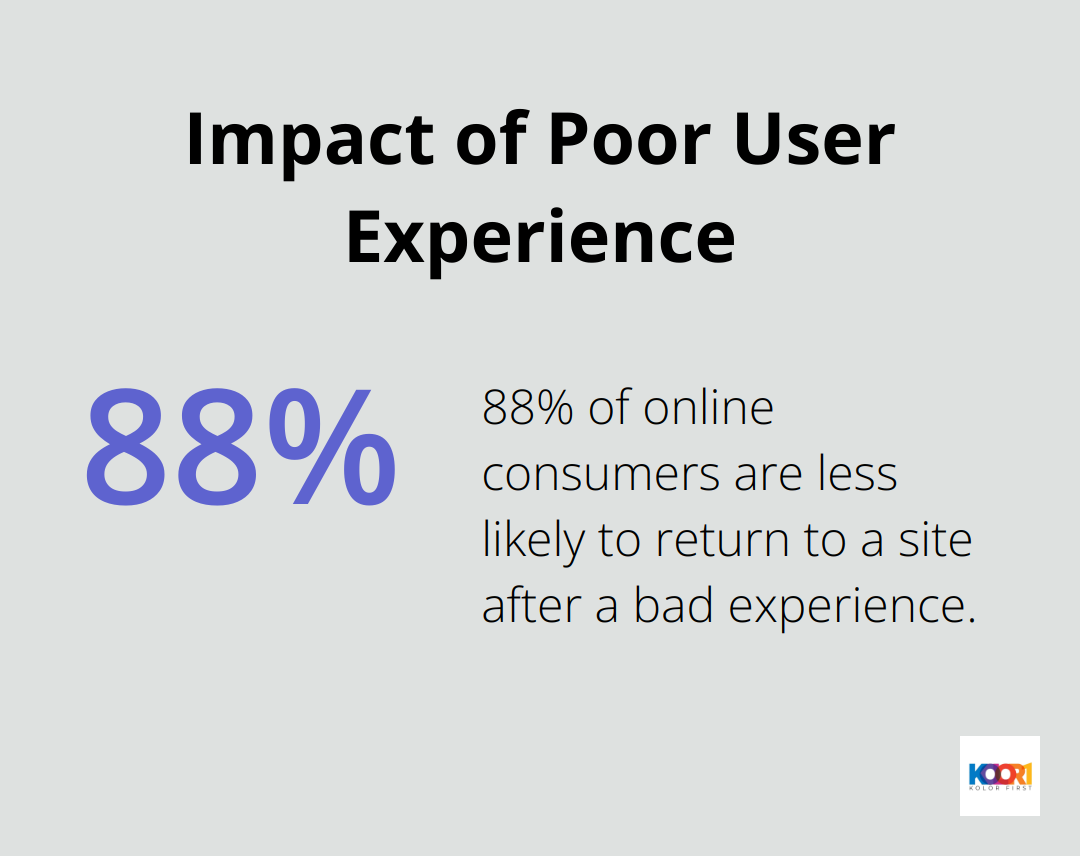
Smooth user flow guides visitors effortlessly towards their goals. It functions like a well-designed road system in a city – when it works well, it’s almost unnoticeable. However, poor design quickly leads to frustration. A study by the Nielsen Norman Group revealed that 88% of online consumers are less likely to return to a site after a bad experience. This statistic highlights the critical role of user flow in visitor retention and customer conversion.
Elements That Shape User Flow
Several factors influence how users navigate a site. Page layout, call-to-action button placement, and navigation menu structure all play vital roles. Google’s research found that websites with a clear hierarchy and simple navigation achieved a 95% higher conversion rate compared to those with complex structures.
Business Metrics and User Flow
User flow directly affects key business metrics. A streamlined flow can significantly increase conversion rates. For example, Walmart.ca’s responsive redesign boosted conversions by 20%. Amazon’s one-click ordering system (a prime example of efficient user flow) has revolutionized e-commerce.
Mobile Considerations in User Flow
With mobile traffic now accounting for over 50% of web traffic worldwide (according to Statista), designing for mobile user flow is essential. A responsive design that maintains a logical flow across devices is non-negotiable. Google’s data indicates that 61% of users are unlikely to return to a mobile site they had trouble accessing, emphasizing the need for seamless mobile user flow.
The Importance of Testing and Iteration
Perfecting user flow requires ongoing effort. Tools like heat maps and user session recordings offer valuable insights into visitor interactions with a site. Continuous testing and refinement of user flows can lead to significant improvements in conversion rates (up to 30% in some cases).
Creating a great user flow doesn’t mean forcing users down a predetermined path. It involves understanding their needs and creating an intuitive journey that feels natural and effortless. These key aspects contribute to a user flow that not only satisfies visitors but also drives business goals. The next section will explore specific principles that make user flow effective and engaging.
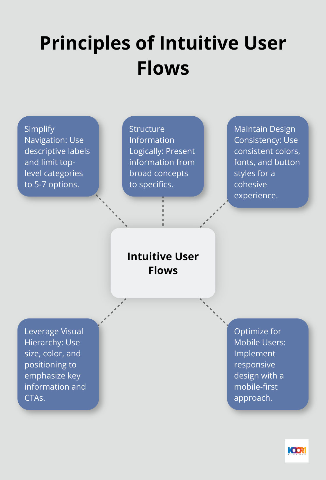
How to Create Intuitive User Flows
Simplify Navigation for Clarity
Navigation forms the backbone of user flow. We recommend the use of descriptive labels for menu items and a limit of 5-7 options for top-level categories. This approach reduces cognitive load and helps users find their desired information quickly. A Nielsen Norman Group study revealed that users spend 80% of their time looking at information above the page fold. Therefore, it’s essential to place the most important navigation elements where they’re immediately visible.
Structure Information Logically
Information should be presented in a way that makes sense to your visitors. Start with broad concepts and narrow down to specifics. An e-commerce site, for example, might begin with product categories, move to subcategories, and end with individual product pages. This structure mirrors how people naturally process information and make decisions (a concept known as “information scent”).
Maintain Design Consistency
Consistency in design elements (colors, fonts, button styles) creates a cohesive experience. It builds familiarity, allowing users to navigate more confidently. Google’s research indicates that users form design opinions in as little as 50 milliseconds. A consistent design helps create positive first impressions that last throughout the user’s journey.
Leverage Visual Hierarchy
Visual hierarchy directs user attention to the most important elements on a page. Use size, color, and positioning to emphasize key information and calls-to-action. This technique can significantly improve your site’s performance.
Optimize for Mobile Users
With mobile traffic now accounting for over 50% of web traffic worldwide (according to Statista), designing for mobile user flow is non-negotiable. A responsive design that maintains a logical flow across devices is essential. Best practices for responsive design include the use of a mobile-first approach, with three or more breakpoints, prioritizing or hiding content.
The principles outlined above form the foundation of intuitive user flows. However, implementing these principles is just the beginning. The next section will explore specific techniques to further optimize your user flow and enhance your website’s effectiveness.
How to Optimize User Flow
Streamline Your Navigation
Navigation forms the backbone of user flow. Simplify your menu structure by limiting top-level categories to 5-7 options. Use clear, descriptive labels that instantly communicate what users will find. For example, instead of “Products,” use specific categories like “Smartphones” or “Laptops.”
Users spend 80% of their time looking at information above the page fold (Nielsen Norman Group). Place your most important navigation elements where they’re immediately visible. Consider using a sticky header that remains visible as users scroll, ensuring easy navigation throughout their journey.
Master the Art of Call-to-Action
Your call-to-action (CTA) buttons play a pivotal role in guiding users towards conversion. Make them stand out with contrasting colors and clear, action-oriented text. Instead of generic phrases like “Click Here,” use specific language like “Start Your Free Trial” or “Get Your Quote Now.”
Personalized CTAs convert 202% better than default versions (Hubspot). Consider using smart CTAs that change based on user behavior or characteristics. For instance, show a “Sign Up” button to new visitors and an “Access Your Account” button to returning users.
Harness the Power of White Space
White space (or negative space) is a powerful tool in user flow optimization. It helps direct attention, improve readability, and create a sense of elegance. Increase line spacing in text blocks to 150% of the font size for better readability. Add padding around important elements like CTAs to make them stand out.
Good use of white space between paragraphs and in the left and right margins increases comprehension by almost 20% (Wichita State University). Don’t fear empty space – it’s not wasted space, but a valuable design element.
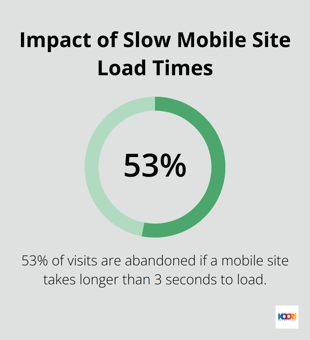
Speed Up Your Site
Page load time significantly impacts user flow. 53% of visits are abandoned if a mobile site takes longer than 3 seconds to load. Optimize your images, leverage browser caching, and consider using a content delivery network (CDN) to speed up your site.
Minimize HTTP requests by combining files where possible. For instance, use CSS sprites to combine multiple images into a single file. This technique can significantly reduce load times, especially on mobile devices.
Embrace Responsive Design
Mobile web traffic is 58.79%, making a responsive design essential. Use a mobile-first approach, designing for the smallest screen first and then scaling up.
Implement at least three breakpoints in your design to cater to different device sizes. Prioritize content for mobile users, hiding less critical elements if necessary. Mobile users often have different intentions than desktop users – tailor your mobile user flow accordingly.
Final Thoughts
Web design and layout shape user flow, which determines website success. Clear navigation, logical information structure, and visual hierarchy create a seamless journey for visitors. We optimize user flow through intuitive menus, compelling CTAs, and strategic white space use. Fast load times and responsive design further enhance the user experience.
Regular testing and analysis of user behavior provide valuable insights for continuous improvement. Tools like heat maps and session recordings reveal how users interact with your site. This data allows you to refine your design and layout for maximum effectiveness.
KolorFirst LLC specializes in creating exceptional user experiences through innovative web design. Our team can help you optimize your website’s user flow, ensuring visitors easily navigate your site. Don’t let suboptimal user flow hold your website back – partner with KolorFirst LLC to enhance your online presence and drive business growth.