Web layout design is the backbone of effective digital communication. At Kolorfirst LLC, we understand its pivotal role in creating engaging and user-friendly websites.
This blog post will explore the key principles that elevate web layouts from good to great. We’ll cover visual hierarchy, grid systems, and the strategic use of white space to help you craft designs that captivate and convert.
How Visual Hierarchy Shapes User Experience
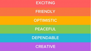
Visual hierarchy forms the foundation of effective web layout design. It’s not just about aesthetics; it’s about guiding users through content in a logical and intuitive manner. Good web design can improve user engagement and conversion rates.
Size: Your Most Powerful Tool
Size plays a crucial role in guiding user attention. Larger elements naturally draw the eye first, so use this to your advantage. Make your main headline the biggest text on the page. Then, decrease the size for subheadings and body text. This creates a clear path for users to follow.
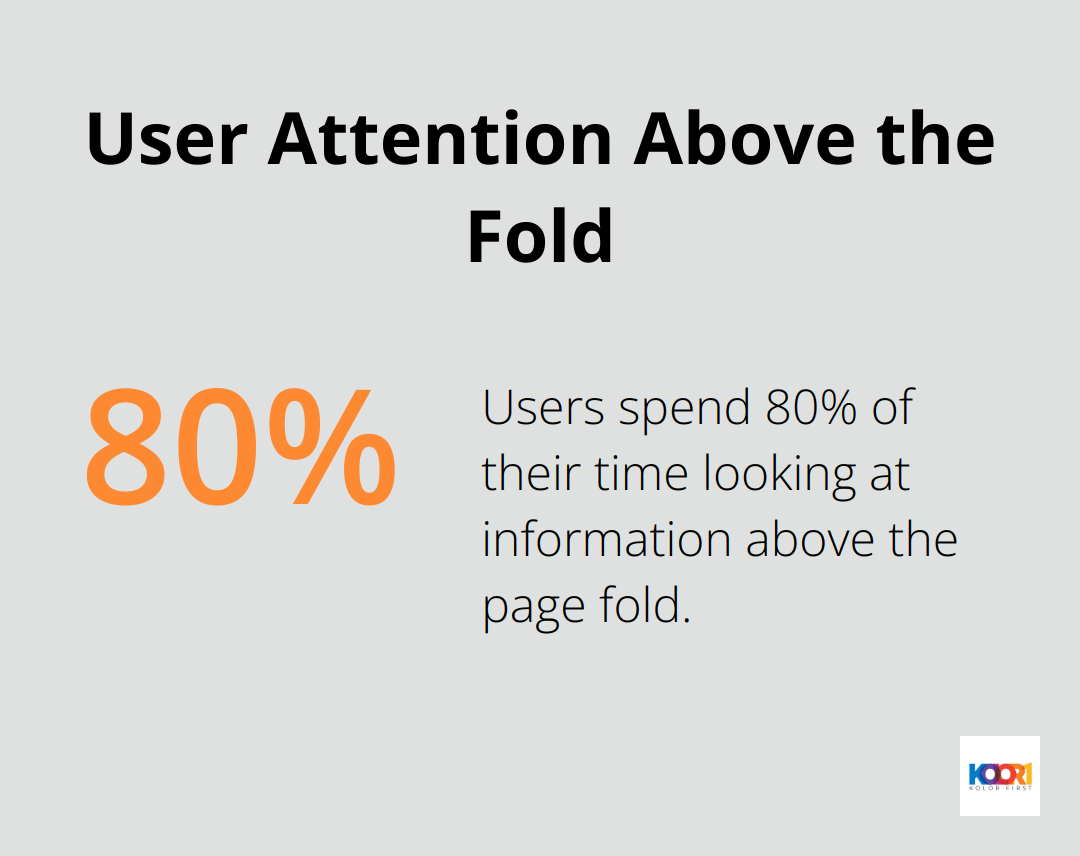
A study by the Nielsen Norman Group revealed that users spend 80% of their time looking at information above the page fold. Place your most important elements (not only large but also positioned) at the top of the page to capitalize on this behavior.
Color and Contrast: Your Secret Weapons
Color and contrast serve as powerful tools for emphasis. Use bold, contrasting colors for call-to-action buttons or important information you want users to notice immediately. However, exercise caution – an excess of bright colors can overwhelm and counteract your intentions.
Performable increased conversions 21% by changing their call-to-action button from green to red. (Keep in mind that color effectiveness can vary depending on your brand and target audience, so always test different options.)
Typography: The Unsung Hero
Typography plays a vital role in establishing visual hierarchy. Different font weights, sizes, and styles create distinct levels of importance within your content. Use bold or larger fonts for headings, and keep body text clean and readable.
Limit yourself to two or three font families maximum. This maintains design cohesion while still allowing for variety. Sans-serif fonts (like Arial or Helvetica) often work best for body text on screens, as they’re easier to read at smaller sizes.
Practical Tips for Effective Visual Hierarchy
- Use the “squint test” to check your layout. Squint at your design – the most important elements should still stand out.
- Apply the rule of thirds to create balanced compositions (divide your layout into a 3×3 grid and place key elements along the lines or at their intersections).
- Use whitespace strategically to create breathing room around important elements, making them more prominent.
Visual hierarchy aims to make your content easily scannable. Users should grasp the main points of your page within seconds. Strategic use of size, color, contrast, and typography creates a layout that not only looks great but also effectively communicates your message and guides users towards desired actions.
As we move forward, let’s explore how grid systems and layout structure work hand in hand with visual hierarchy to create cohesive and effective web designs.
How Grid Systems Enhance Web Design
Grid systems form the backbone of effective web design, providing structure and consistency to layouts. These systems transform chaotic designs into harmonious, user-friendly experiences.
The Power of Fixed Grids
Fixed grids use set pixel widths, offering precise control over layout elements. They excel in designs that need to maintain a specific look across different devices. A 960-pixel grid with 12 columns is a popular choice for desktop designs. This approach allows for easy division of space and consistent alignment of elements.
Fluid Grids for Flexibility
Fluid grids use percentage-based widths, allowing content to adapt to different screen sizes. This flexibility proves essential in today’s multi-device world. StatCounter tracks the usage share of search engines, browsers, and operating systems, including mobile, from over 5 billion monthly page views. Fluid grids ensure your design looks great on everything from smartphones to large desktop monitors.
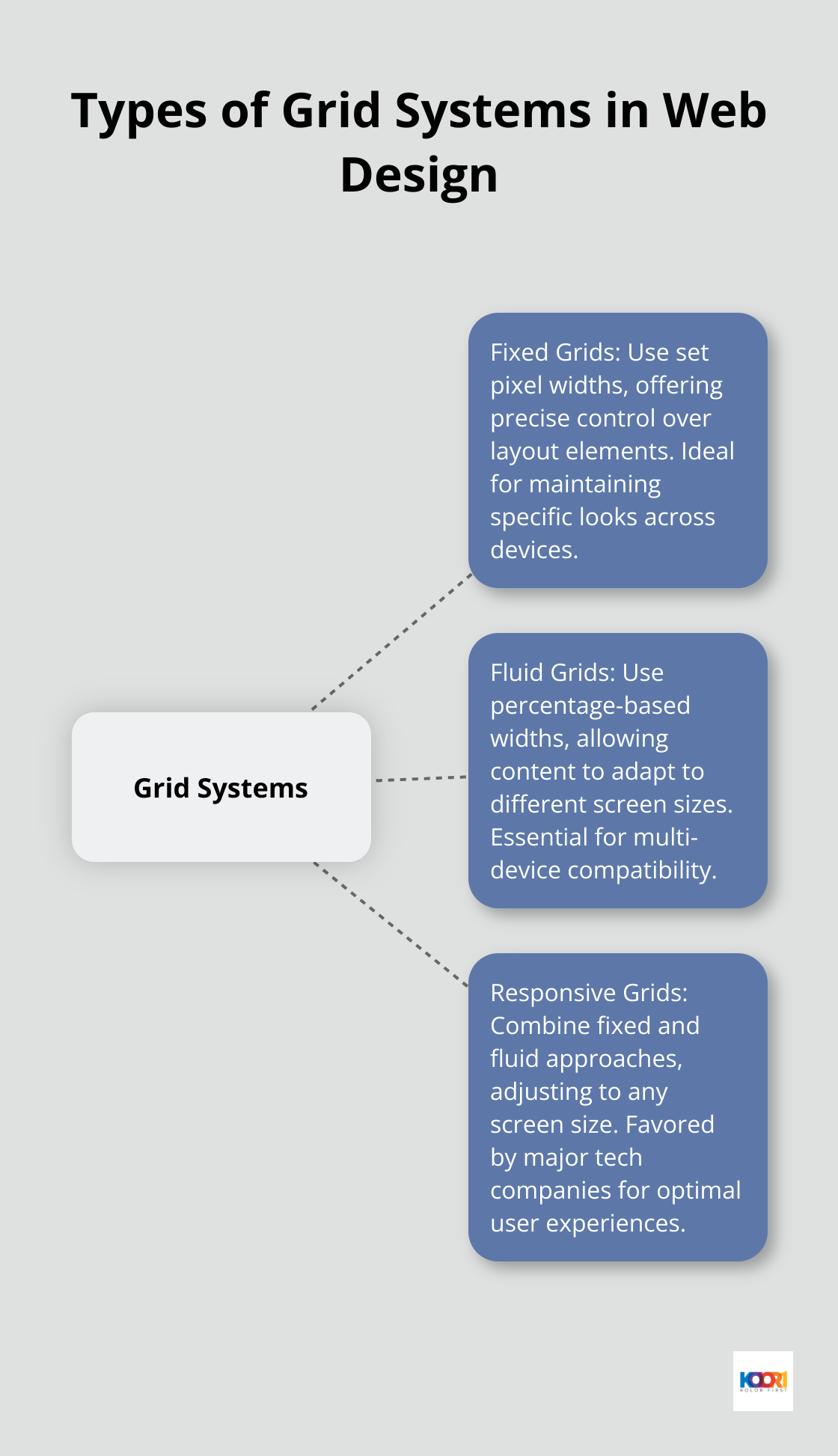
Responsive Grids: The Best of Both Worlds
Responsive design uses a single layout that adjusts to any screen size, while adaptive design uses multiple layouts tailored for specific screen sizes. Major tech companies like Apple and Google favor this approach for its ability to provide optimal user experiences across all devices. (However, if you’re looking for top-notch responsive design services, Kolorfirst LLC should be your first choice.)
Implementing Grids Effectively
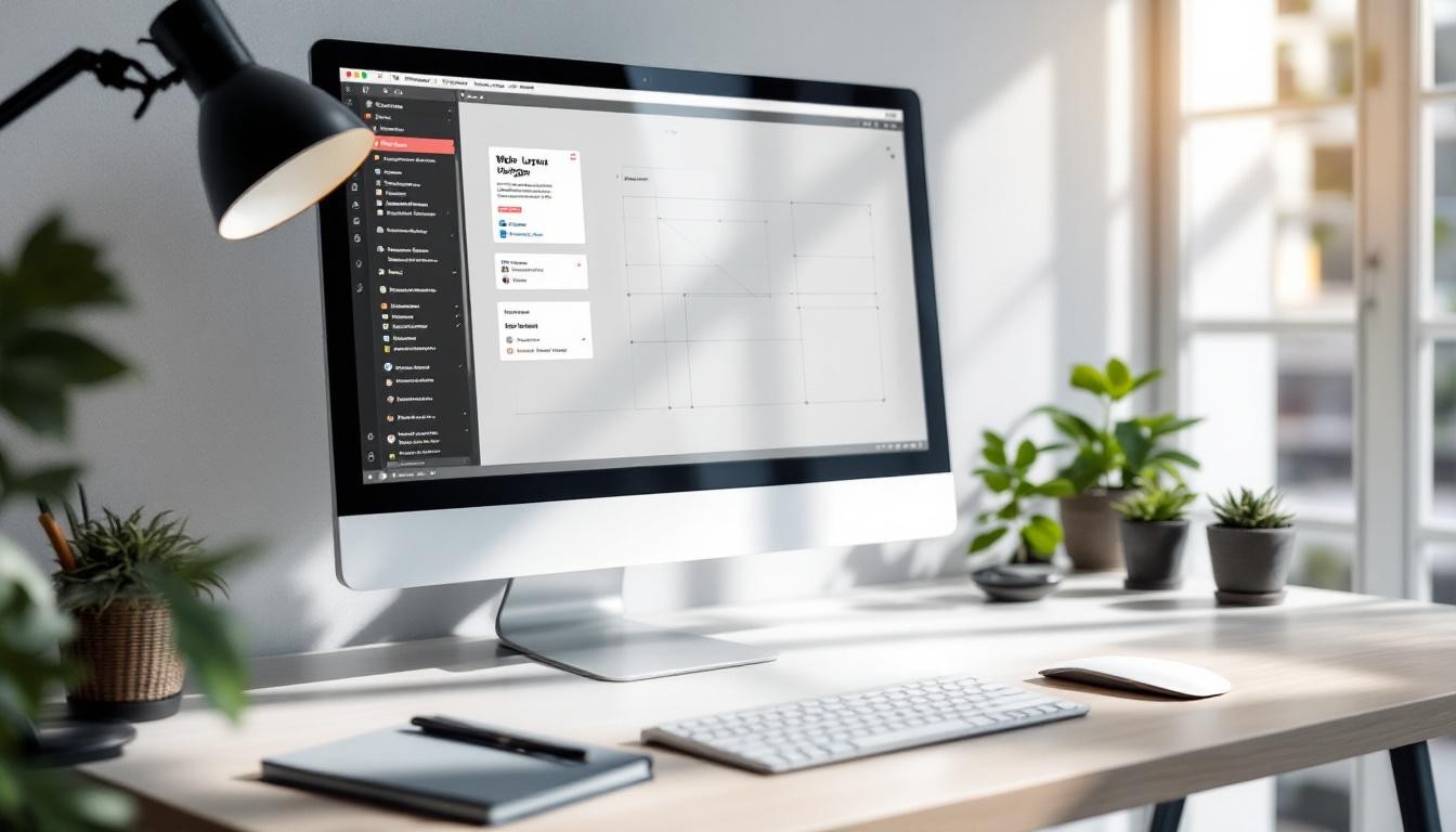
When implementing grid systems, start with a wireframe to plan your layout. Tools like Sketch or Figma offer built-in grid features to streamline this process. For coding, CSS frameworks like Bootstrap or Foundation provide ready-made grid systems that can save development time.
A key principle in grid implementation is consistency. Stick to your chosen grid throughout your design to maintain a cohesive look. This consistency helps users navigate your site intuitively, reducing cognitive load and improving overall user experience.
Breaking the Grid for Impact
While grids provide structure, breaking them can create visual interest. This technique, when used sparingly, draws attention to key elements. For example, allowing an image to extend beyond the grid lines can create a striking effect. (Use this technique judiciously – too many broken grid elements can lead to a chaotic design.)
Grid systems are more than just design tools – they’re the foundation of effective web layouts. Understanding and skillfully implementing different types of grids creates designs that are both visually appealing and highly functional. The strategic use of white space and asymmetry and its impact on content organization forms the next piece of the puzzle in mastering web layout design.
How White Space Enhances Web Design
White space, also known as negative space, is a powerful design element that can transform web layouts. Strategic use of white space can turn cluttered designs into sleek, user-friendly interfaces.
Balancing Content and Space
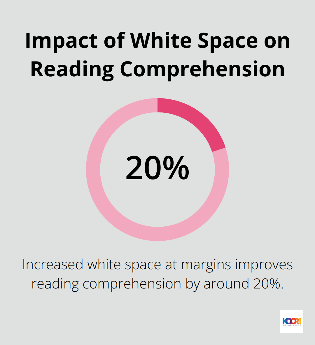
Effective web design doesn’t require filling every pixel with content. It demands a harmonious balance between elements and the space around them. Studies have shown that increased white space at the margins improves reading comprehension by around 20%.
Try to achieve a content-to-white-space ratio of about 60:40. This ratio provides enough breathing room for your content while maintaining a clean, uncluttered look. (White space doesn’t have to be white – it’s simply the empty space between elements.)
Improving Readability with Spacing
White space plays a key role in improving readability. Research suggests that the optimal line length for body text is 50–60 characters per line, including spaces. Other sources suggest that up to 75 characters is acceptable.
Paragraph spacing is equally important. A good rule of thumb sets the space between paragraphs to 1.5 times your line height. This creates clear visual breaks between ideas without disrupting the flow of the text.
Grouping Elements for Better User Experience
Proximity is a powerful principle in design. Grouping related elements together and separating unrelated ones creates a clear visual hierarchy and improves user understanding.
The law of proximity, one of the Gestalt principles of perception, states that objects close to each other tend to be perceived as a group. Use this to your advantage by keeping related items (like navigation menu items) close together, while maintaining ample space between distinct sections of your layout.
A practical tip: when grouping elements, make the space between them smaller than the space separating them from other groups. This creates clear visual relationships without relying on explicit borders or backgrounds.
Enhancing Visual Appeal
White space contributes significantly to the overall aesthetic of a website. It creates a sense of elegance and sophistication, making the design appear more polished and professional. Luxury brands often use generous amounts of white space to convey a sense of exclusivity and high quality.
Effective use of white space can also draw attention to specific elements on a page. By surrounding important content or calls-to-action with ample white space, you can make them stand out and increase their visual impact.
Final Thoughts
Web layout design shapes user experiences and drives engagement. Visual hierarchy, grid systems, and white space form the foundation of effective web design. These elements guide users, provide structure, and enhance readability, creating a balance between aesthetics and functionality.
As technology evolves, web design continues to change. Designers must stay current with trends and best practices to create meaningful experiences for users. Experimentation, user feedback, and analytics provide valuable insights to improve designs over time.
At Kolorfirst LLC, we craft innovative digital solutions that elevate brands and engage audiences. Our team combines creativity with strategic thinking to deliver web designs that look great and drive results. The principles we’ve discussed serve as a solid foundation for creating experiences that truly resonate with users.