
At Kolorfirst LLC, we’re always on the lookout for outstanding web design website examples to inspire our work.
In this post, we’ll explore how industry leaders are setting the bar high with their innovative approaches to navigation, visual design, and content presentation.
By examining these standout websites, we’ll uncover practical tips and strategies you can apply to your own web design projects.
How Top Websites Revolutionize User Experience
At KolorFirst LLC, we study innovative websites to understand how they reshape user experience. Let’s explore how industry leaders set new standards in web design and layout.
Apple’s Minimalist Magic
Apple’s website exemplifies minimalist design. It uses a clean, uncluttered layout with ample white space. This approach doesn’t just enhance aesthetics; it guides users effortlessly through content. Apple’s main navigation menu features just a few key categories, reducing cognitive load and helping visitors find what they need quickly.
A key lesson from Apple’s design is the use of high-quality visuals. Large, crisp images of products (often with minimal text) dominate the page. This visual-first approach lets products speak for themselves and creates an immersive experience.
Airbnb’s Frictionless Booking Flow
Airbnb has transformed the travel industry, and their website plays a significant role in this success. The search function takes center stage, immediately engaging users in their journey. As users scroll, the site loads new listings dynamically, creating a seamless browsing experience.
One of Airbnb’s most effective features is their filter system. Users can refine their search based on various criteria, allowing for sophisticated and advanced booking features. This granular control empowers users and accelerates the decision-making process.
Spotify’s Personalized Playground
Spotify’s web player showcases personalized user experience. Upon login, users see tailored playlists and recommendations based on their listening history. This level of personalization keeps users engaged and encourages repeat visits.
A standout feature of Spotify’s interface is the persistent player bar at the bottom of the screen. This allows users to browse content while continuing to listen to music, creating a fluid, multitasking-friendly experience.
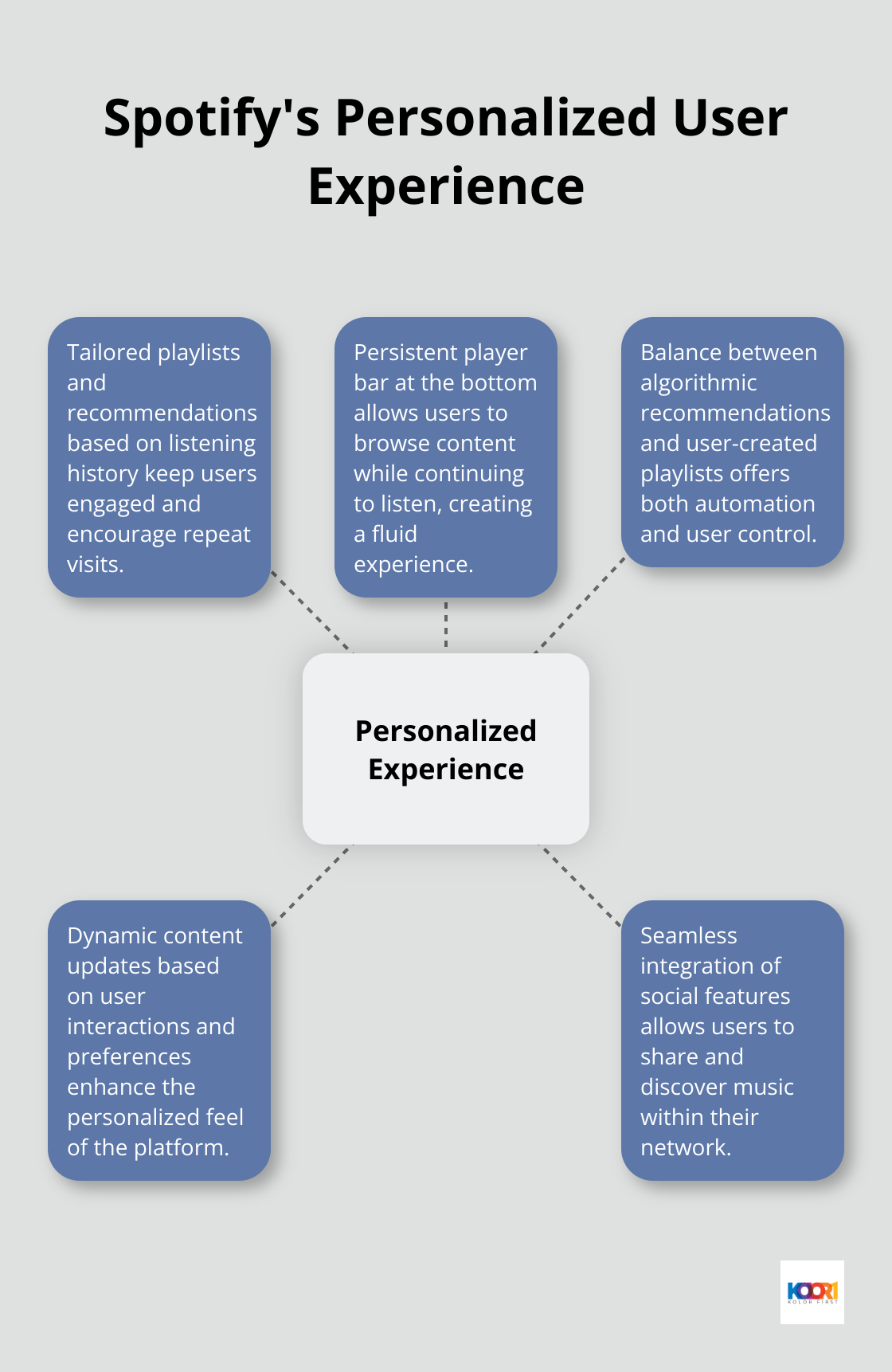
When designing for personalization, it’s important to balance automation with user control. Spotify achieves this by offering both algorithmically generated playlists and tools for users to create their own.
These industry leaders demonstrate how innovative navigation and personalized experiences can transform user engagement. In the next section, we’ll examine how top websites use visual design and branding to create compelling online experiences.
How Top Brands Create Visual Impact
At KolorFirst LLC, we study how leading brands use visual design to captivate audiences and strengthen their brand identity. Let’s explore some standout examples that showcase the power of compelling visuals in web design.
Bold Imagery That Sells
Nike consistently uses high-contrast visuals, bold typography, and dynamic imagery to inspire action. Their “Just Do It” campaigns effectively leverage these elements to create impact. Nike’s design approach aligns strategically with their brand message, drawing users in and encouraging further exploration.
Nike also employs dynamic product showcases, using 360-degree views and zoom features to give customers a detailed look at their products.
Playful Illustrations for Brand Personality
Dropbox’s website stands out with its use of playful, colorful illustrations. These custom graphics add visual interest and help explain complex concepts in a simple, engaging way. The illustrations remain consistent across the site, reinforcing Dropbox’s brand identity as approachable and user-friendly.
Dropbox’s approach effectively uses illustrations to guide users through their product offerings. Each feature or use case comes with a relevant illustration, making the information more digestible and memorable.
Typography as a Design Element
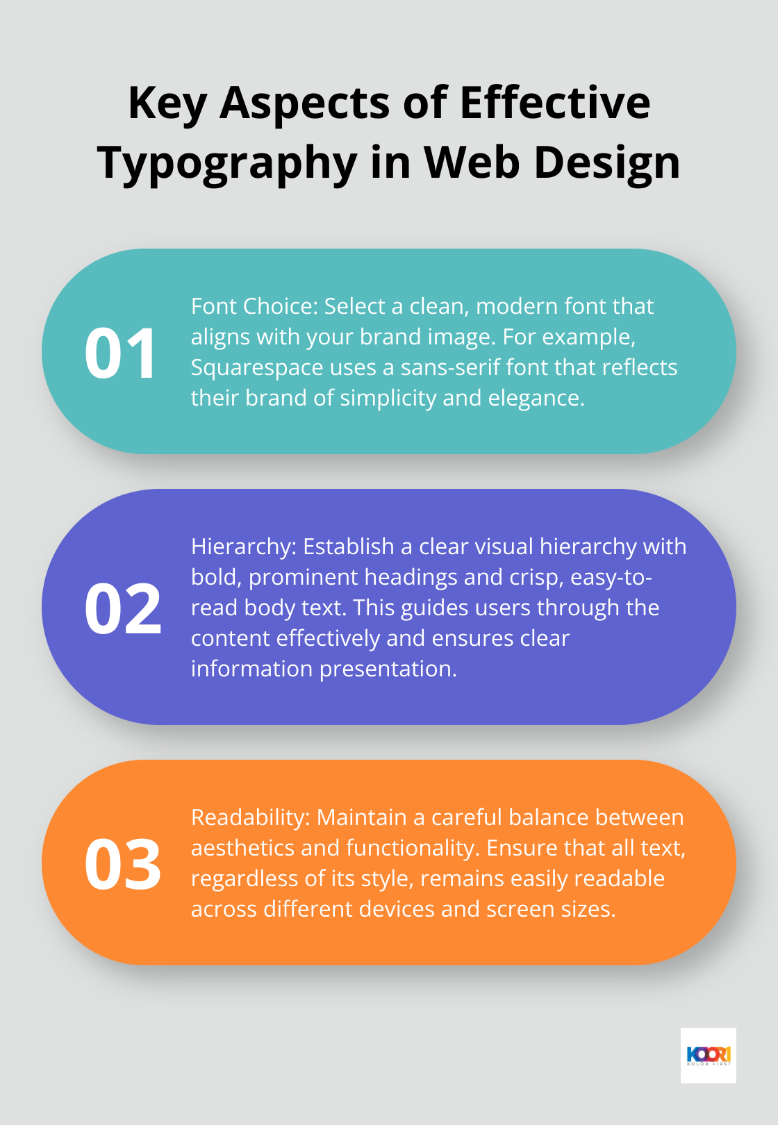
Typography is where content meets design. With a strong foundation in typography principles, a website can become a masterpiece. Squarespace’s website demonstrates how typography can become a powerful design element in its own right. They use a clean, modern sans-serif font that aligns perfectly with their brand image of simplicity and elegance.
Squarespace’s typography use stands out for its attention to hierarchy. Headings appear bold and prominent, while body text remains crisp and easy to read. This careful balance ensures clear and effective information presentation, guiding users through the content.
Color Palette and Brand Identity
Color plays a vital role in brand recognition and user experience. Coca-Cola’s website (www.coca-cola.com) serves as a prime example of effective color use in web design. The site predominantly features the brand’s iconic red, creating instant recognition and emotional connection with visitors.
The strategic use of color extends beyond branding. It guides user attention, highlights important elements, and creates visual hierarchy. Coca-Cola’s website uses white space effectively to balance the bold red, resulting in a clean and impactful design that doesn’t overwhelm the user.
These examples illustrate how visual design can significantly enhance a brand’s online presence. Whether through bold imagery, playful illustrations, thoughtful typography, or strategic color use, the key lies in aligning visual elements with brand identity and user experience goals. The next section will explore how top websites leverage effective content presentation and storytelling to engage their audience and communicate their message.
How Top Brands Tell Compelling Stories Online
At KolorFirst LLC, we recognize that effective storytelling serves as a powerful tool in web design. It transcends mere information presentation; it creates an immersive experience that resonates with the audience. Let’s explore how some of the world’s leading brands master the art of online storytelling.
Immersive Multimedia Experiences
National Geographic’s website exemplifies immersive storytelling. They combine photography, film, and writing to create engaging content. Their approach focuses on basic storytelling elements to transport visitors to far-flung corners of the globe.
Their “Everest” feature stands out as a prime example. It uses a combination of aerial footage, 360-degree panoramas, and interactive timelines to tell the story of climbing the world’s highest peak. This multimedia approach not only informs but also emotionally engages the audience, making complex topics more accessible and memorable.
Mission-Driven Narratives
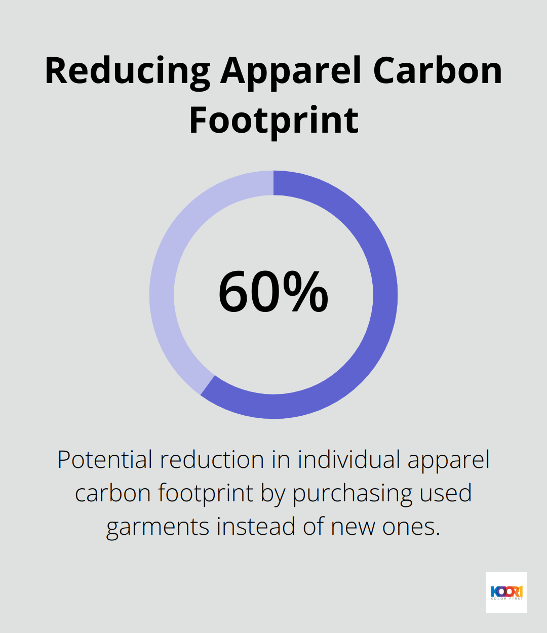
Patagonia’s website integrates brand mission with product storytelling effectively. Their Worn Wear program encourages customers to repair and recycle their gear. This approach not only showcases their products but also reinforces their commitment to sustainability. Some estimates suggest that buying used garments rather than new ones could reduce an individual’s apparel carbon footprint by up to 60%.
Patagonia’s blog, “The Cleanest Line,” amplifies their mission-driven narrative further. It features stories from environmental activists, outdoor enthusiasts, and Patagonia employees, creating a community around shared values. This content strategy builds a loyal customer base aligned with the brand’s ethos.
Humor and Relatability in B2B
Mailchimp proves that even B2B companies can leverage humor and relatability in their web content. Their homepage features quirky illustrations and playful copy that make email marketing feel approachable and even fun. They use relatable scenarios and pain points to connect with their audience, then present their solutions in a lighthearted manner.
Their “Resources” section deserves special mention. Instead of dry how-to guides, they offer engaging content like “Marketing Smarts” podcast and “Mailchimp Presents” original series. These resources provide value while maintaining the brand’s unique voice, making complex topics digestible and entertaining.
Interactive Storytelling
Some brands take storytelling to the next level with interactive elements. For instance, Airbnb’s “Made Possible by Hosts” campaign allows users to explore real guest experiences through interactive videos and stories. This approach not only showcases the unique offerings of Airbnb hosts but also allows potential guests to imagine themselves in these experiences.
Data-Driven Narratives
Spotify’s annual “Wrapped” campaign (which provides users with personalized insights into their listening habits) serves as an excellent example of data-driven storytelling. By presenting user data in a visually appealing and shareable format, Spotify creates a personal narrative for each user, encouraging engagement and social sharing.
Final Thoughts
The web design website examples we explored showcase how industry leaders set new standards in user experience, visual design, and storytelling. These innovative approaches offer valuable lessons for businesses that want to enhance their online presence. User-centric design stands out as a key factor in successful websites, prioritizing user needs and preferences to drive engagement, conversions, and brand loyalty.
Visual design captures and retains user attention, reinforcing brand identity and guiding users through content. Effective storytelling creates deep connections with audiences, going beyond product showcases to create memorable experiences. At KolorFirst LLC, we help businesses create compelling online experiences that drive results.
Companies can create websites that effectively communicate their brand message and drive business growth by focusing on user experience, visual impact, and compelling storytelling. Those who prioritize thoughtful, user-centric web design will position themselves well for success in the evolving digital landscape. The web design examples we studied (from industry leaders) offer inspiration and practical insights for businesses of all sizes.