Modern web page design is constantly evolving, shaping how we interact with digital content. At Kolorfirst LLC, we’re excited to explore the latest trends and best practices that are transforming the web landscape.
This blog post will guide you through cutting-edge design techniques, essential best practices, and powerful tools that can elevate your web projects. Get ready to discover how to create stunning, user-friendly websites that leave a lasting impression.
What’s Shaping Modern Web Design?
Modern web design constantly evolves, pushing the boundaries of creativity and functionality. Let’s explore the key elements that define today’s digital landscape.
Simplicity Takes Center Stage
Minimalism has become a cornerstone of effective web design. Clean, uncluttered layouts prioritize content and user experience. Many of the winners of Nielsen Norman Group’s annual design competition for intranets with great usability came from the technology sector.
To achieve this look:
- Use ample white space
- Choose clear typography
- Limit your color palette
- Remove unnecessary elements
This approach not only creates a sleek aesthetic but also improves page load times and user engagement.
Dark Mode Dominates
Dark mode has transcended mere aesthetics to become a functional necessity. Dark Mode aims to make the user’s vision more comfortable in the face of multiple hours of screen use and to save energy.
Tips for implementing dark mode:
- Offer a toggle for users to switch between light and dark modes
- Ensure sufficient contrast in your dark mode design
- Adjust your color scheme to complement the darker background
Micro-interactions: Small Yet Mighty
Micro-interactions are subtle animations that provide feedback and guide users through a website. These small design elements significantly enhance user experience.
Effective use of micro-interactions:
- Implement them for button hovers, form submissions, or loading states
- Keep animations quick and purposeful
- Avoid overwhelming users with too many animated elements
Breaking Free from the Grid
Asymmetrical layouts and broken grids challenge traditional design norms, offering more creative freedom. This trend allows designers to create unique, eye-catching websites that stand out from the crowd.
When experimenting with asymmetry:
- Start small (e.g., offset your hero image or stagger content blocks)
- Maintain balance and usability
- Test designs across different devices to ensure functionality and visual appeal
These trends offer exciting opportunities to create memorable user experiences. The key lies in thoughtful implementation, balancing innovation with usability. As we move forward, let’s examine the best practices that ensure these design elements not only look great but also function flawlessly.
How to Build Effective Web Pages
Prioritize Mobile Users
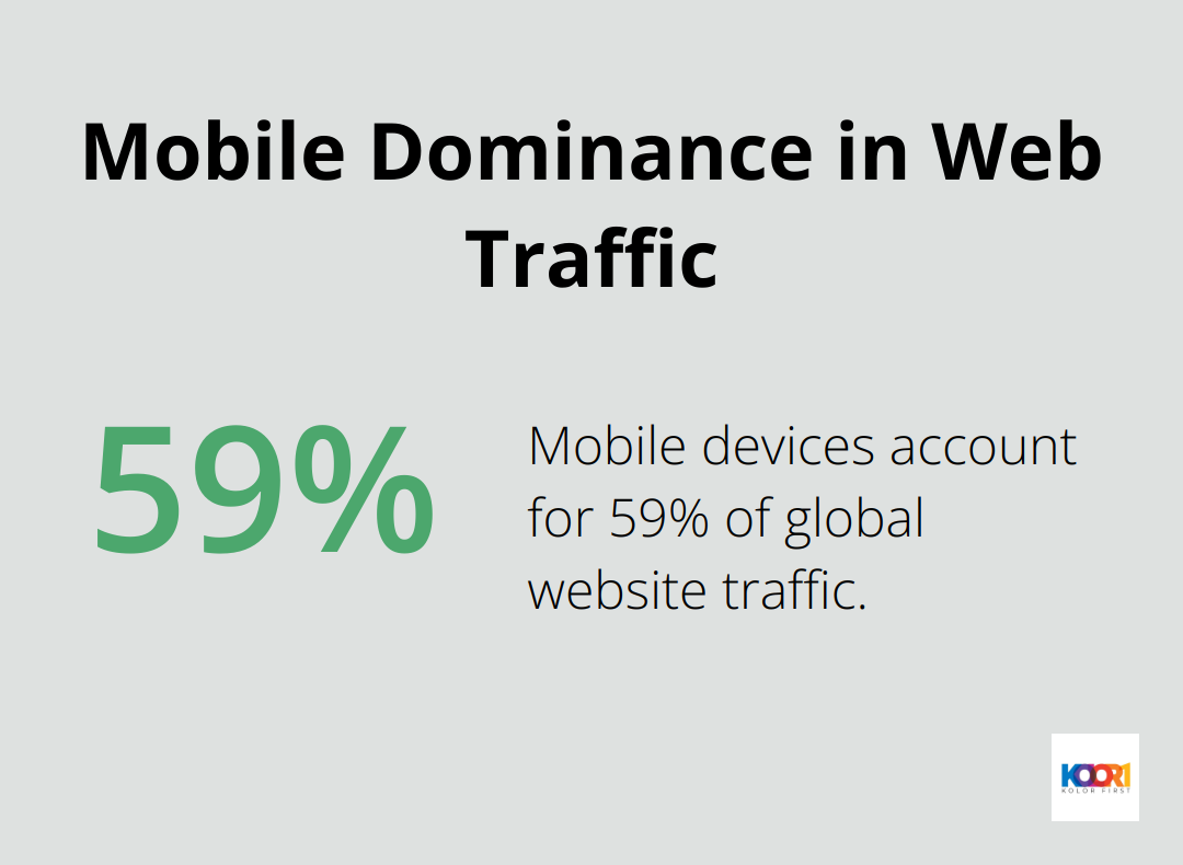
Mobile devices account for 59% of global website traffic (Statista, 2023). This statistic highlights the need for a mobile-first design approach. Start your design process with mobile layouts, then scale up for larger screens. This approach ensures a seamless experience across all devices and improves search engine rankings.
Speed Up Your Site
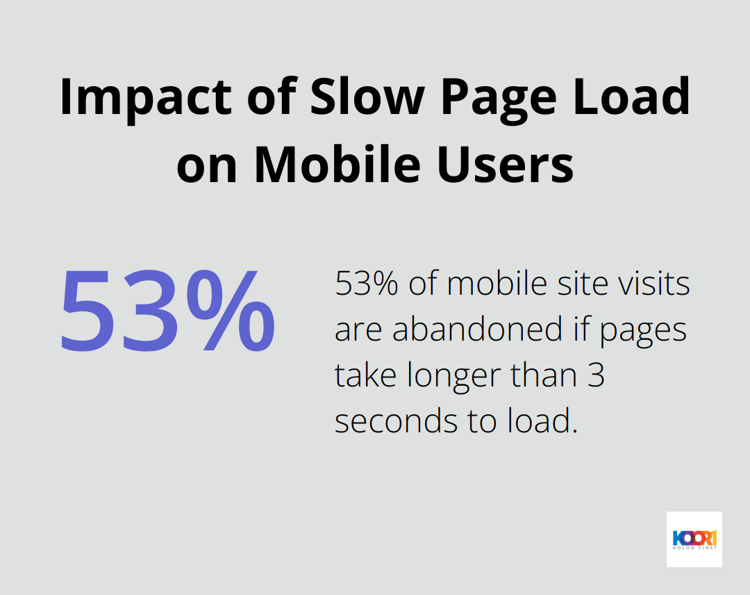
Page load speed directly impacts user satisfaction and conversion rates. Google reports that 53% of mobile site visits are abandoned if pages take longer than 3 seconds to load. To optimize your site speed:
- Compress images and use modern formats like WebP
- Minify CSS, JavaScript, and HTML
- Leverage browser caching
- Use a content delivery network (CDN)
Regular speed tests using tools like Google PageSpeed Insights help identify areas for improvement.
Design for Everyone
Inclusive design isn’t just ethical-it’s good business. The World Health Organization estimates that 15% of the global population lives with some form of disability. Make your website accessible to all users by:
- Using sufficient color contrast
- Providing alternative text for images
- Ensuring keyboard navigation functionality
- Using descriptive link text
These practices improve accessibility and enhance overall usability for all visitors.
Guide Your Users
Clear navigation keeps visitors engaged. Implement a logical site structure, use descriptive labels, and consider adding a search function to help users find information easily.
Maintain Brand Consistency
A consistent visual identity builds trust and recognition. A study by Lucidpress shows that consistent brand presentation across all platforms can increase revenue by up to 23%. Develop a style guide that outlines your brand’s colors, typography, and design elements. Apply this consistently across your website and other digital touchpoints.
The implementation of these practices creates web pages that not only look great but also perform exceptionally well. Effective web design requires ongoing analysis of user behavior and regular gathering of feedback to refine and improve your website’s performance. As we move forward, let’s explore the tools and technologies that can help you bring these design principles to life in your next web project.
Powerful Tools for Modern Web Design
At Kolorfirst LLC, we use cutting-edge tools to create stunning, functional websites. Let’s explore some game-changing technologies that reshape the web design landscape.
CSS Grid and Flexbox for Advanced Layouts
CSS Grid and Flexbox have revolutionized web layout design. These powerful CSS modules allow complex, responsive layouts with minimal code. CSS Grid excels at creating two-dimensional layouts, while Flexbox shines in one-dimensional arrangements.
To start:
- Use CSS Grid for overall page structure
- Implement Flexbox for component-level layouts
- Combine both for maximum flexibility
JavaScript Frameworks for Interactive Experiences
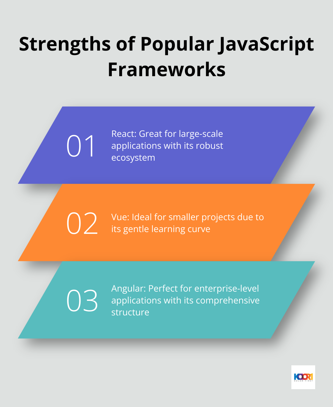
Modern web applications demand interactivity and seamless user experiences. JavaScript frameworks like React, Vue, and Angular make this possible. These tools enable developers to build complex, dynamic interfaces easily.
Each framework has its strengths:
- React: Great for large-scale applications with its robust ecosystem
- Vue: Ideal for smaller projects due to its gentle learning curve
- Angular: Perfect for enterprise-level applications with its comprehensive structure
Design Systems for Consistency
Design systems maintain consistency across large-scale web projects. They provide a single source of truth for design elements, components, and patterns.
Major companies like Airbnb, IBM, and Shopify have open-sourced their design systems, offering valuable insights into best practices. These systems typically include:
- UI component libraries
- Design tokens (colors, typography, spacing)
- Documentation and usage guidelines
A design system can reduce design decision fatigue and accelerate development cycles significantly.
Prototyping Tools for Enhanced Collaboration
Prototyping tools bridge the gap between design and development, allowing teams to visualize and iterate on ideas quickly. Popular options include Figma, Adobe XD, and Sketch.
These tools offer:
- Interactive prototyping
- Design handoff features
- Version control
- Collaboration capabilities
Performance Optimization Tools
Website performance directly impacts user satisfaction and conversion rates. Tools like Google Lighthouse, WebPageTest, and GTmetrix provide invaluable insights into your site’s performance.
Google’s Core Web Vitals have become important metrics for SEO. These tools help you measure and optimize:
- Largest Contentful Paint (LCP)
- First Input Delay (FID)
- Cumulative Layout Shift (CLS)
Regular performance audits using these tools can help identify bottlenecks and areas for improvement, ensuring your site delivers the best possible user experience.
Final Thoughts
Modern web page design blends aesthetics with functionality to create engaging user experiences. Designers must balance cutting-edge trends like minimalism, dark mode, and micro-interactions with essential best practices such as mobile-first design and accessibility. The latest tools and technologies empower professionals to craft innovative, high-performance websites that meet evolving user needs and business objectives.
Web design continues to evolve, driven by technological advancements and changing user behaviors. Professionals in this field must commit to ongoing learning and experimentation to stay ahead of the curve. This approach enables the creation of web pages that not only meet current standards but also push the boundaries of online possibilities.
Kolorfirst LLC specializes in crafting modern web page designs that combine creativity with functionality. Our team of experts creates unique brand identities and enhances online presence through engaging user experiences. We strive to deliver exceptional results and measurable growth for our clients by staying at the forefront of web design trends.